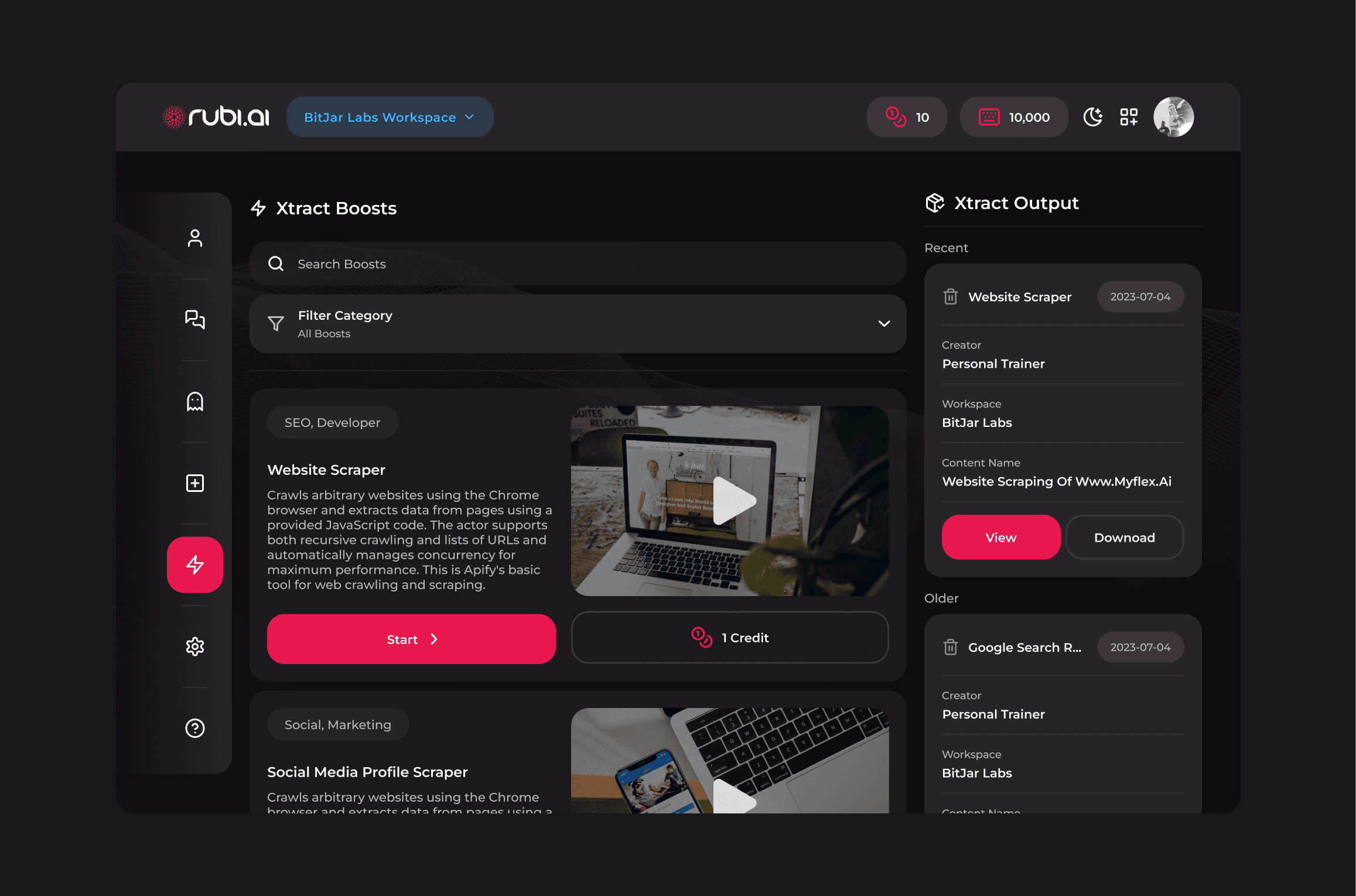
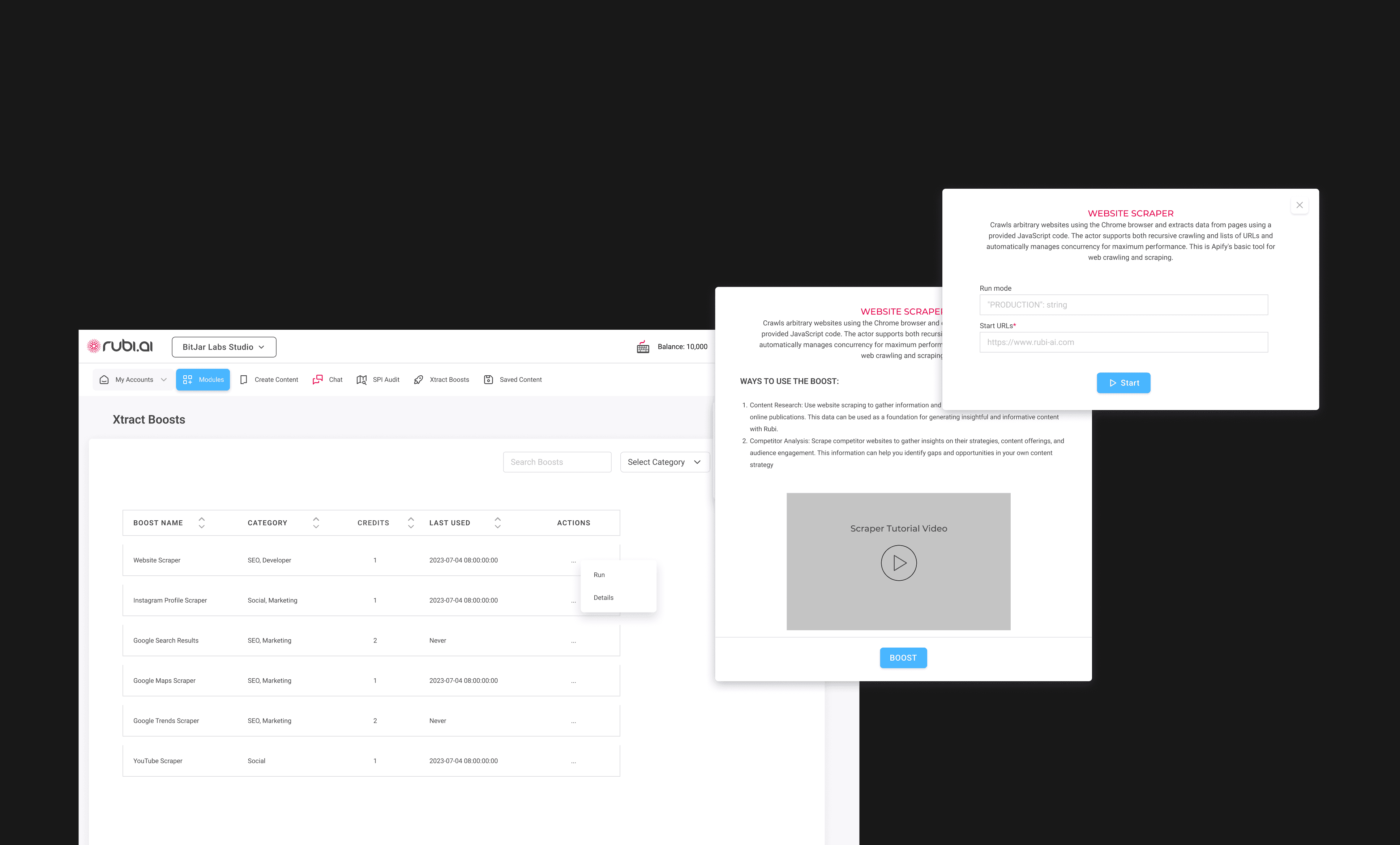
The main obstacle with this section of the platform was of how bland, and "form-like" it was. The features were all there, but it was unintuitive, and looks far too intimidating for unfamiliar users.
Much like the other original designs in this project, it was also not easily accessible from other areas of the platform
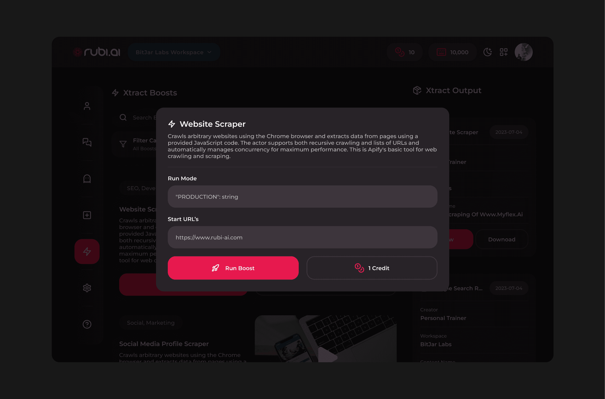
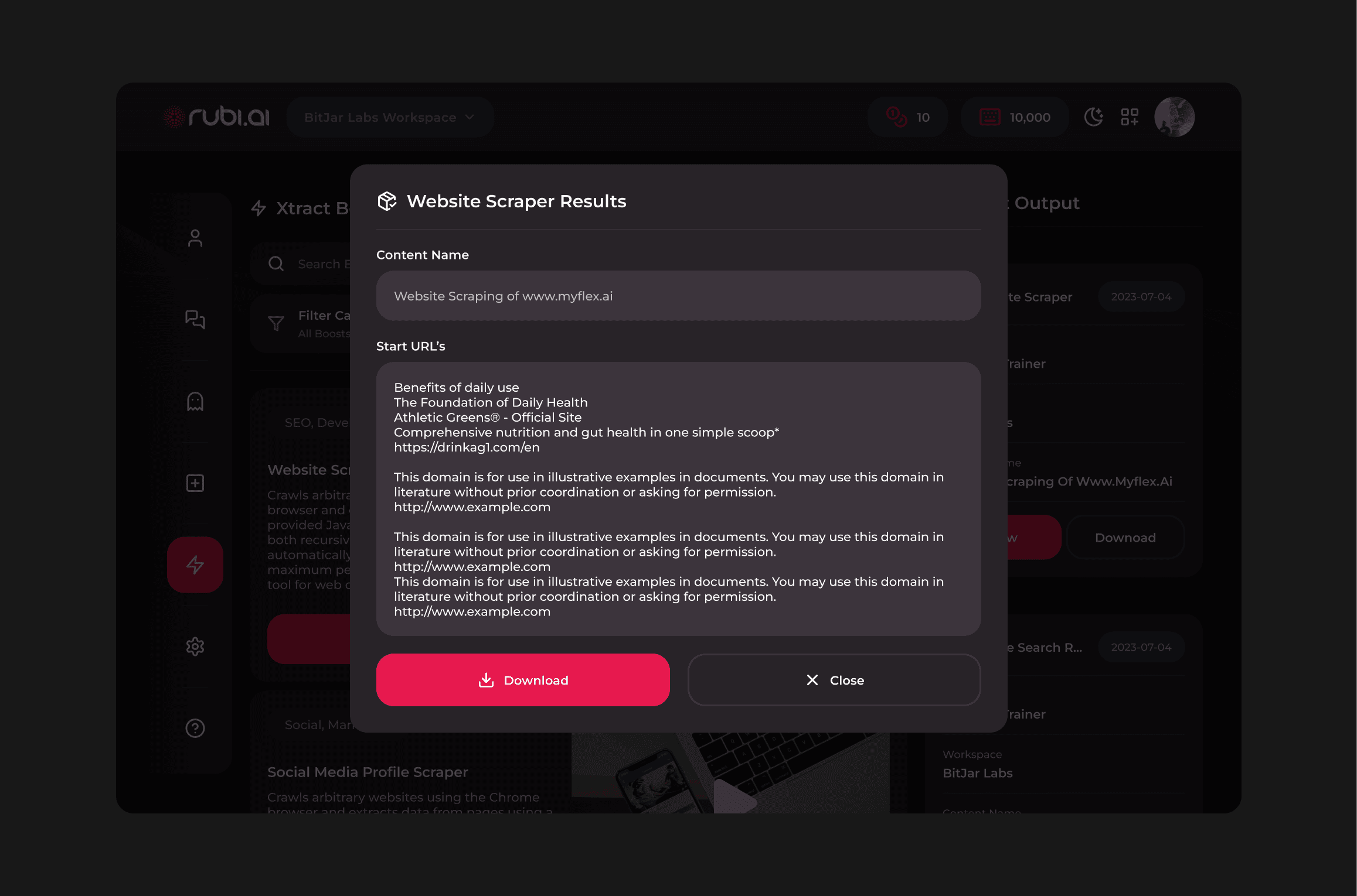
By making it clear what booster options the user had, in a blocky, friendly way, and by providing helpful tooltip-like tutorial videos, the feature very quickly becomes far more approachable and easy to operate.
It is also included in the nav-bar ensure its easy to access, as it would be a frequently used feature to an active user.