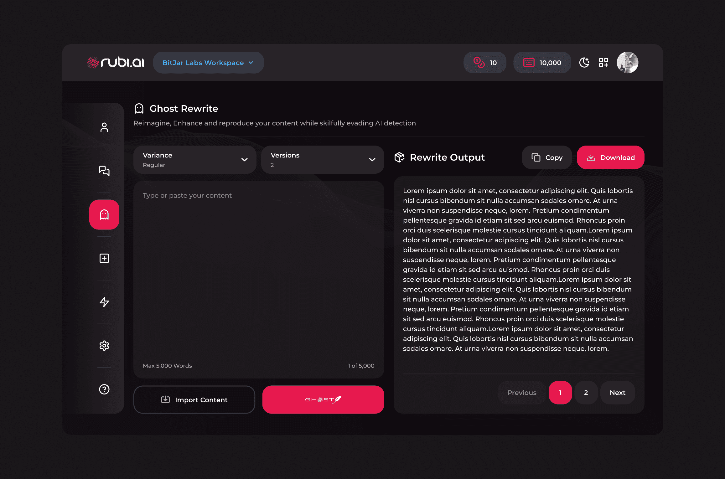
I didn't find too much wrong with the original design. Apart from the obvious fact that it lacked the consistent style of the rest of the platform, it was also not easily accessible for unfamiliar users.
Like I said, I felt the structure worked just fine, so by simply applying the style language I had been working on, the section quickly looked and felt like it belonged.
I also granted it a spot on the nav menu for easy access